A service reminder sticker gets only a few seconds of attention, usually when the customer is already thinking about everything else on their day. If the layout is cluttered, the writing area is too small, or the message is hard to read through the windshield, it will not do its job. That is why knowing how to design effective service reminder stickers matters for shops, dealerships, and service departments that want more repeat business from routine maintenance.
The best reminder stickers are not decorative. They are working tools. They need to be easy for staff to fill out, easy for customers to notice, and durable enough to stay in place until the next service date. Good design improves all three.
What makes a service reminder sticker effective
An effective sticker answers the customer’s basic question without making them hunt for details. What was done, and when should they come back? Everything on the sticker should support that purpose.
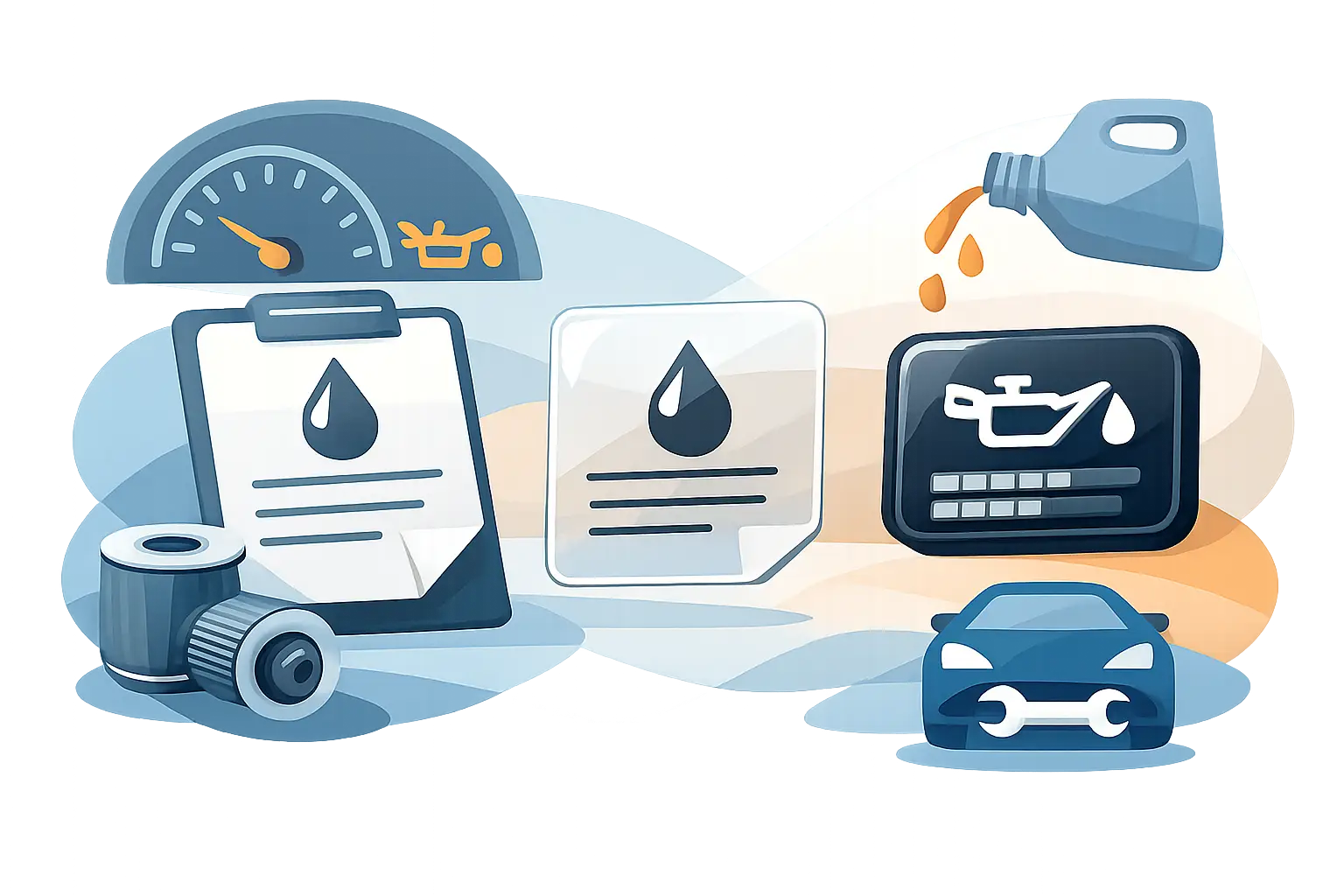
In practical terms, that means the design needs clear hierarchy. The next service date or mileage should stand out first. Your shop name and phone number should be obvious second. Any extra information, such as oil grade, tire re-torque timing, or internal service codes, should be included only if it helps the service process.
This is where many shops overbuild the layout. They try to fit every possible field onto a small label, and the result is a sticker that looks busy before anyone writes on it. A crowded design usually creates slower write-in time at the counter and lower readability in the vehicle.
Start with the specific use case
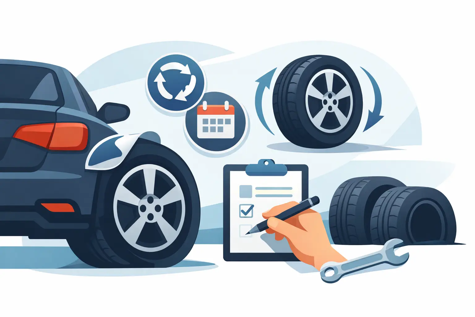
Before you choose colors, fonts, or shape, decide what the sticker is actually for. Oil change reminders, tire rotation reminders, detailing reminders, tire storage labels, and maintenance light stickers all have different jobs. The right design for one is not always right for another.
An oil change sticker usually needs the next due date, next due mileage, and business contact information. A tire re-torque label may need a shorter return window and stronger visual emphasis on urgency. A detailing reminder can lean more on booking follow-up service and customer retention. If the sticker is tied to compliance or safety, the message should be more direct and less promotional.
This is one of the biggest design trade-offs. A universal sticker can simplify ordering, but a purpose-built sticker usually performs better because the layout is matched to the service.
Keep the message simple and readable
If you want to know how to design effective service reminder stickers, start with readability before branding. Customers need to understand the reminder at a glance, often through glass, in changing light conditions.
That means using a clean font, strong contrast, and enough open space around key fields. Small type may look efficient on screen, but it often fails once it is printed and handwritten. Script fonts, thin lettering, and low-contrast color combinations create problems fast.
A practical design usually includes a bold label for NEXT SERVICE, NEXT DUE DATE, or NEXT DUE MILEAGE, with clearly defined write-in areas. If your staff writes by hand, leave enough room for real handwriting, not ideal handwriting. Pens with broader tips, quick notes from technicians, and rushed service lanes all affect what the final sticker looks like.
Short wording also helps. “Next Oil Change” is better than a long sentence. “Call to Book” is better than a paragraph. Stickers work best when every word earns its place.
Size and shape affect real-world use
A sticker can have a perfect design on paper and still fail in the bay if the size does not fit the application. Too small, and the writing area becomes cramped. Too large, and it can look intrusive on the windshield or interfere with placement standards.
Most service departments do better with a format that balances visibility and convenience. Rectangles are common for a reason. They are easy to print, easy to organize, and efficient for filling in service details. Custom shapes can support branding, but they are not always the best choice for speed or writing space.
Placement matters too. If the sticker is intended for the inside windshield, think about how it will look from both the technician’s side and the driver’s side. The design needs to remain legible where it will actually live, not just where it was approved in a proof.
Use branding, but do not let branding take over
A reminder sticker should reinforce your shop identity. It should not compete with the reminder itself.
Your logo, business name, phone number, and maybe a website or service category can all add value. They help the customer know who completed the work and who to call when service is due again. That supports retention, especially for independent shops and multi-location operations that want consistent brand visibility.
But branding has a limit. If the logo is oversized, the color background is too dark for handwriting, or the design uses too many visual elements, the sticker becomes harder to use. In most cases, a clean branded header or footer works better than a full-bleed promotional layout.
This is where straightforward design wins. High quality prints and strong shop branding matter, but function still comes first.
Choose materials for shop conditions
Design is not only about what is printed. Material choice affects whether the sticker keeps doing its job after it leaves your service bay.
Service reminder stickers need dependable adhesive, good print quality, and a stock that works with the writing method you use. If your team writes with ballpoint pen, marker, or pencil, test for smearing and drying time. If stickers are exposed to heat, cold, sunlight, or regular handling, the face stock and adhesive need to hold up.
A glossy finish may look sharp, but it can create glare and make writing more difficult depending on the pen. A writable matte surface is often the better operational choice. If easy removal matters, that should be considered early too. Some shops want firm hold until the next service. Others want the label to peel off cleanly when replaced.
Good design decisions are tied to production realities. A sticker that looks polished but slows down technicians or fails in temperature swings is not an effective business tool.
Design for speed at the service counter
The best sticker for your customer is usually also the best sticker for your staff. Fast write-in, fast application, and low error risk all matter in busy service environments.
That means organizing the sticker in the order your team uses it. If staff writes the date first and mileage second, place those fields in that sequence. If your process includes advisor initials, stock number, or recommended service type, add them only if they are consistently used. Empty fields that never get filled in waste space and make the sticker look incomplete.
This is especially important for shops ordering in volume. Small layout improvements can save real time over hundreds or thousands of service visits. StickerPlanet Canada focuses heavily on these repeat-use print products for that reason. In a working shop, efficient design is not a small detail. It affects day-to-day throughput.
Color should guide attention
Color can improve sticker performance, but only when it is used with restraint. Strong color blocks can separate sections, highlight due information, or make your brand easy to recognize. They can also reduce readability if overused.
A good rule is to keep the write-in area light and uncluttered. Use darker or bolder color for headings, borders, or brand elements, then let the handwritten information stay front and center. Black on white remains one of the most readable combinations, especially through glass.
If you manage several reminder types, color coding can help staff identify them quickly. Oil service, tire service, and detailing reminders may each use a different accent color. Just make sure the system is simple enough that new staff can learn it without confusion.
Proof the design in actual use
Screen approval is not the same as field testing. Before committing to a full run, print samples and use them the way your team actually will.
Write on them with your standard pens. Apply them where they will be placed. Check readability from outside the vehicle. See whether technicians can complete them quickly without crowding the text. If a field is always skipped or the writing spills outside the box, the layout needs adjustment.
This step catches the issues that proofs miss. Fonts that looked large enough may print small. Light color areas may not offer enough contrast. A clean design on screen may feel cramped in a fast-moving service lane.
Small details that improve results
The difference between an average reminder sticker and a strong one usually comes down to practical details. Clear field labels, enough room to write, durable stock, and clean branding all add up. None of them are flashy, but they make the sticker more useful.
If you are redesigning your current sticker, do not ask only whether it looks better. Ask whether it helps your team work faster and gives the customer a clearer reason to return. That is the standard that matters.
A good service reminder sticker is one of the simplest retention tools in your shop. When it is designed well, it keeps your name in front of the customer, supports the next visit, and does its job without slowing down the one you are already handling.