A customer steps into your shop, looks down for half a second, and already knows where to stand, where to pay, or what service to ask about. That is why the best floor graphics for auto shops are not just decorative. They solve traffic flow, support safety, and turn unused floor space into clear communication.
In an auto shop, every sign has a job. Floor graphics are no different. They need to hold up to foot traffic, work on the right surface, stay readable in a busy service area, and make sense for the way customers and staff actually move through the building. If a graphic looks good but peels early, causes confusion, or gets ignored, it is not doing its job.
What makes the best floor graphics for auto shops?
The best floor graphics for auto shops usually do one of three things well. They direct people, reinforce a process, or promote a service without getting in the way. That might mean a set of footprint decals leading customers from the front door to the service counter, a clear waiting area marker, or a seasonal tire promotion placed where people naturally pause.
Durability comes first. Auto shops are harder on printed materials than most retail spaces. Dirt, moisture, snow, salt, and cleaning chemicals all shorten the life of poor-quality graphics. A floor decal for a quiet office lobby is not the same product you want near a service entrance or cashier station. You need materials built for commercial use, with a slip-resistant surface and adhesive suited to the floor type.
Clarity matters just as much. A floor graphic has a second or two to communicate. Short messages, strong contrast, and simple shapes outperform crowded designs every time. Customers should understand the message while walking, not stop and study it.
Start with the purpose, not the design
A common mistake is choosing floor graphics based on appearance alone. In a working shop, the practical question is simpler: what problem are you trying to solve?
If your front counter gets congested, floor markers can organize the queue and define where the next customer should stand. If customers wander into staff-only areas, directional decals can steer them back to the right path without adding another wall sign. If you want to increase upsells, a floor graphic near the payment area can remind customers about tire storage, detailing, alignments, or seasonal inspections.
The right format depends on the goal. Directional graphics should be bold and minimal. Promotional graphics can carry a little more branding, but they still need to be easy to read at a glance. Safety-oriented graphics need the clearest language of all.
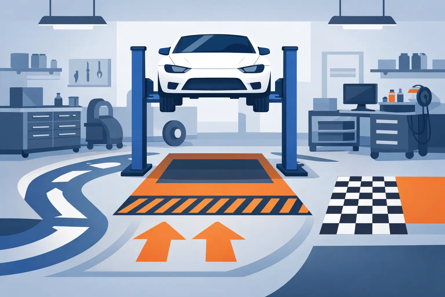
Best uses for floor graphics in an auto shop
Customer flow is the strongest use case. Most shops do not have unlimited lobby space, and even a well-run service desk can get messy during morning drop-off. Floor decals can mark check-in lines, pickup zones, and waiting positions in a way that feels organized without adding clutter.
Service promotions are another solid fit. A floor graphic near the service counter can support messages that already matter to your business, such as oil changes, tire rotation reminders, brake inspections, or detailing offers. This works best when the message connects to what the customer is already there for. Random branding with no callout tends to fade into the background.
Safety communication is often overlooked, but it is one of the most useful applications. Wet floor warnings, customer boundary markers, and directional indicators around doors or parts pickup areas can reduce confusion and support a cleaner process. In some shops, this is more valuable than any promotional message.
The floor graphic types that work best
Simple shape decals are often the most effective choice. Circles, arrows, footprints, and rectangular position markers are easy to recognize and easy to place. They work well for queue management, distancing markers, and directional traffic.
Full-color branded floor decals are better when you want the graphic to do double duty. These can include your logo, a service message, and a strong visual callout. They are useful in customer-facing areas where branding matters, especially near the reception desk, entrance, or pickup counter.
Short-term promotional floor graphics make sense for seasonal campaigns. Tire season, winter service checks, and detailing promotions are good examples. The trade-off is that short-term graphics are not the best choice for high-abuse areas. If the message is temporary but the traffic is constant, you still need a material strong enough to last through the campaign.
Material and surface matter more than most buyers expect
Not every shop floor is the same, and the best floor graphics for auto shops depend heavily on where they will be installed. Smooth commercial tile in a customer lounge is very different from sealed concrete near a service desk. Texture, moisture exposure, and cleaning routines all affect performance.
Smooth indoor floors usually give you the widest range of options and the cleanest install. Concrete can work well too, but surface prep becomes more important. Dust, oil residue, and uneven texture can reduce adhesion fast. If a floor graphic is going into an area exposed to shop grime, it needs both the right adhesive and a realistic expectation for lifespan.
Laminate matters because foot traffic is not your only concern. Shops track in grit. Customers drag boots across decals. Staff may roll equipment nearby. A slip-resistant protective layer helps with safety and extends the life of the print. Skipping that protection to save money usually costs more when the decal has to be replaced early.
Placement is where results are won or lost
A good floor graphic in the wrong spot is wasted money. The strongest placements are the places where customers slow down naturally: the entrance, the service counter approach, the cashier area, waiting room thresholds, and pickup points.
Do not place important messages where people are moving too quickly to notice them. A narrow hallway or a doorway with constant traffic is better for directional arrows than for sales messaging. If you want a customer to read a service offer, put it where they stand, not where they stride past.
It also helps to think in zones. The entry zone is for orientation. The service counter zone is for process and upsell messaging. The waiting zone is for reinforcement. When graphics match the customer journey, they feel useful instead of random.
Design choices that hold up in real shop conditions
High contrast wins. Dark text on a light background or the reverse will stay readable longer than subtle brand colors with low visibility. Large type, short wording, and one clear message per graphic usually perform best.
Branding should support the message, not bury it. Your logo belongs there if it strengthens recognition, but the main point still needs to be obvious. “Check in here,” “Please wait here,” or “Ask us about tire storage” will outperform a graphic that looks polished but says too much.
Photos and detailed artwork can work, but they are not always the best fit for the floor. Scuffs and dirt show up faster on busy, detailed graphics. Cleaner layouts tend to age better in a working environment.
When custom floor graphics are worth it
Stock floor decals are fine for general direction and standard messaging. But custom graphics are worth it when you want consistency with your shop branding, a specific service message, or sizing that fits your layout properly.
That matters more for multi-location shops and dealerships, where consistent signage supports a more professional customer experience. It also matters for independent shops that want every printed piece to carry the same look across reminder stickers, counter signs, and floor graphics. StickerPlanet Canada works with shops that need those repeat-use print materials to stay consistent, practical, and fast to reorder.
Custom is also the better choice when floor space is limited. A standard size may be too large for a small reception area or too small to catch attention in an open lobby. Getting the dimensions right helps the graphic do its job without overpowering the space.
How to choose the right floor graphics for your shop
If your main concern is customer flow, choose durable directional decals with simple wording and proven slip resistance. If your goal is upselling, use branded promotional graphics near the service or payment area. If safety and process control are the bigger issues, keep the design plain, direct, and highly visible.
It also helps to be honest about traffic level. A lightly used waiting room can support more design flexibility. A heavy-use entrance needs a tougher product and a simpler message. There is always a trade-off between visual complexity and long-term appearance in a shop setting.
The best buying decision is usually the one that matches your floor condition, your traffic pattern, and the message customers need right now. Not every shop needs a large branded decal. Sometimes a few well-placed markers do more for the customer experience than a full graphic package.
A floor graphic should earn its place just like any other shop supply. If it directs, informs, or sells without creating maintenance headaches, it is doing exactly what it should.