
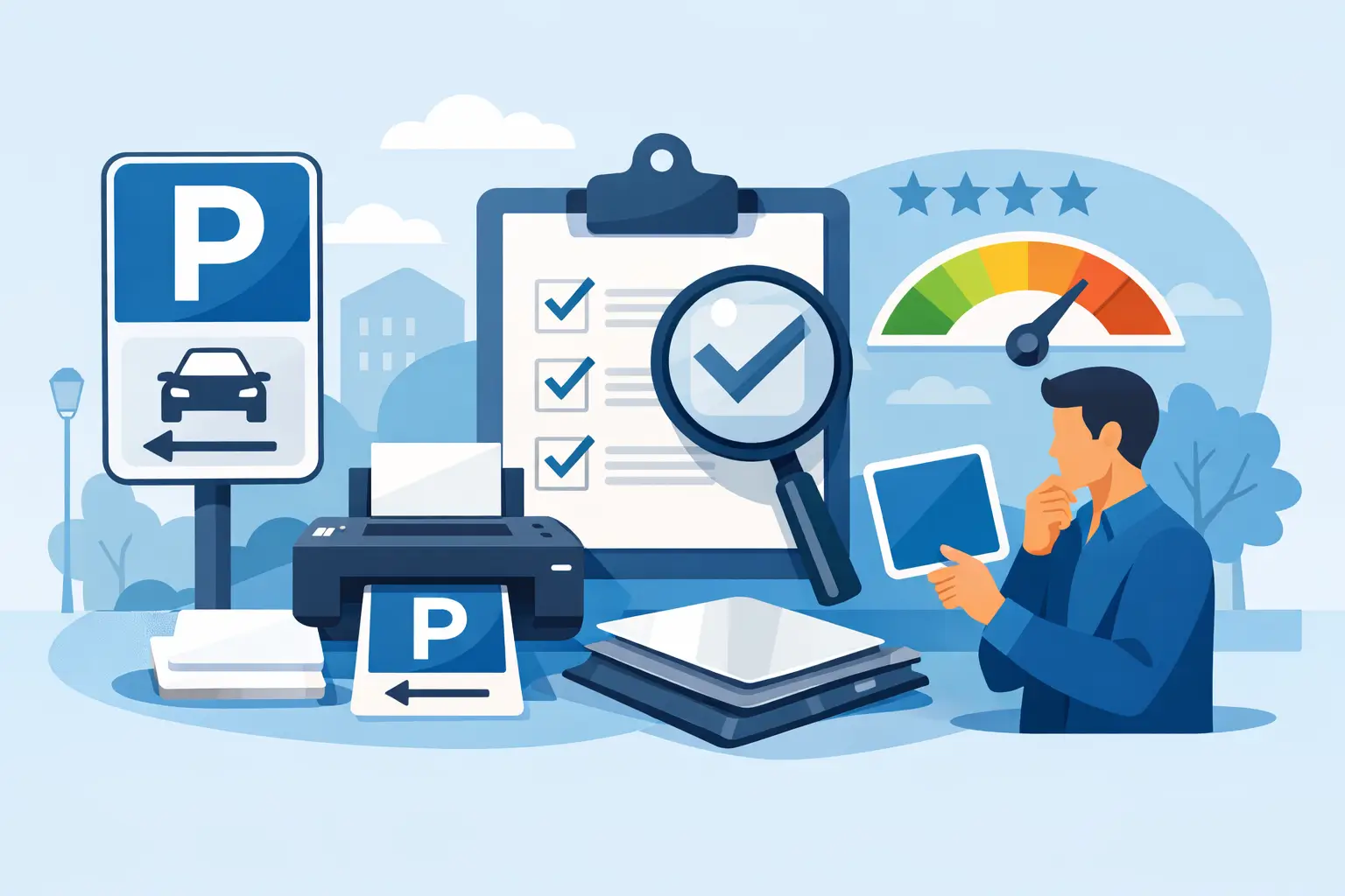
A parking sign has a short job to do: tell a driver what applies before they make the wrong turn, use the wrong space, or block access to your business. That is why a useful parking sign printing review cannot stop at whether a sign looks sharp on screen. It needs to examine visibility, material choice, printing quality, and whether the finished sign will hold up where it is installed.
For auto shops, dealerships, tire centers, commercial properties, and customer-facing businesses, parking signs help keep daily operations moving. Reserved service parking, customer pickup zones, employee-only areas, fire lanes, accessible spaces, and no-parking zones are all easier to manage when instructions are clear and professionally displayed.
What a Parking Sign Printing Review Should Measure
A good sign is functional before it is decorative. The strongest printed parking signs give drivers the information they need quickly, from the distance and angle where they are likely to see it. That means the review should start with legibility, not just color selection or logo placement.
The most useful questions are straightforward. Can someone read the main instruction without stopping directly in front of the sign? Is the message understandable in a few seconds? Does the sign still stand out when the lot is busy, wet, dusty, or poorly lit? If the answer is no, even premium printing will not solve the operational problem.
Readability Comes Before Branding
Your logo belongs on a parking sign when it helps identify the property or reinforces a professional appearance. It should not compete with the main instruction. “Customer Parking,” “Service Lane,” or “No Parking” needs to be the first thing a driver sees.
High-contrast color combinations usually perform best. Dark lettering on a light background, or light lettering on a dark field, is generally easier to read than low-contrast colors that look polished in a design proof but disappear at a distance. Large type, limited wording, and simple symbols also improve fast recognition.
Avoid treating a parking sign like a flyer. A full paragraph, small phone number, or oversized logo may fit on the layout, but drivers do not have time to study it. If your property has detailed rules, use the main sign for the core direction and place secondary information where people can safely read it after parking.
Material Must Match the Environment
Material selection is where many printing decisions become expensive later. An indoor sign behind a service counter has very different demands than a sign mounted at the edge of a snowy lot, near road salt, or in direct summer sun.
Aluminum is a practical choice for permanent outdoor parking signs because it is lightweight, resists rust, and works well for pole mounting. Composite aluminum panels can also suit many commercial applications, especially where a rigid, clean-looking sign is needed. Plastic sign materials can be a cost-effective option for short-term use, indoor areas, or protected locations, but they may not be the right fit for a long-term exterior installation.
The right answer depends on where the sign will be used, how long it needs to last, and what it may encounter. A temporary directional sign does not need the same construction as a permanent accessible parking marker. Spending for outdoor-grade material where it matters is usually less costly than replacing signs after one season.
Start With the Conditions in Your Lot
Before ordering, walk the property as a driver would. Approach entrances from both directions. Look for visual clutter, blocked sightlines, light poles, landscaping, stacked tires, delivery vehicles, and other signs competing for attention. These conditions affect the size and placement you need.
A sign near a busy service drive may need larger lettering than one inside a small private lot. A sign mounted too low can be blocked by parked vehicles. One installed too high may be missed by drivers looking ahead for an open space. The goal is not simply to place a sign somewhere visible from the office window. It is to place it where the driver needs the instruction.
Weather also changes the decision. In Canada and northern U.S. markets, freeze-thaw cycles, snow clearing, road salt, and strong seasonal temperature changes can be hard on poorly chosen signs and hardware. In hotter regions, prolonged sun exposure can make fade resistance a higher priority. Tell your print supplier where and how the sign will be installed so the recommendation fits the job.
Printing Details That Separate Durable Signs From Disposable Ones
A parking sign is an operational tool, so print quality should be judged by more than a crisp first impression. Outdoor signs need inks, finishes, and substrates suited to exposure. Ask how the graphics are produced and whether the recommended material is intended for exterior use.
For signs that must be visible at night or in low light, reflective material may be worth the added cost. It can improve visibility when headlights hit the sign, making it a practical option for entrances, restricted zones, loading areas, and lots that operate after dark. It is not necessary for every sign, but it deserves consideration when lighting is limited.
A protective finish can also help in high-contact locations. Signs near entrances, gates, payment equipment, or service lanes may be exposed to grime, cleaning, scratches, and repeated handling. The more demanding the environment, the more important it is to prioritize durability over the lowest starting price.
Color consistency matters when you are ordering multiple signs across a property. A customer should not have to guess whether two slightly different blue signs carry the same type of instruction. Consistent colors, fonts, and layout rules make the lot easier to navigate and make your business look organized.
Parking Sign Printing Review: Size and Placement
There is no single best sign size. The correct size depends on viewing distance, vehicle speed, available mounting space, and the amount of information required. A small reserved-parking sign can work well close to a parking stall, while an entrance sign directing vehicles toward service, customer, or delivery areas may need significantly more presence.
As a practical rule, use fewer words as viewing distance increases. If you need a driver to make a decision from across a lot, lead with the key direction in the largest text. Supporting details can be smaller, but the primary instruction should remain clear at a glance.
Mounting holes and hardware requirements should be confirmed before production. A sign that arrives without the hole placement needed for your existing posts creates extra work and delays installation. If your property uses standard poles, wall mounting, fencing, or freestanding frames, provide those details when ordering.
Also consider whether the sign will need to be updated. Service departments sometimes change traffic flow, designate seasonal tire storage pickup areas, or add customer drop-off instructions. When change is likely, ordering a coordinated set of replaceable signs may be more practical than building one permanent sign with too much specific information.
How to Compare Parking Sign Printing Suppliers
Price matters, particularly when replacing or outfitting multiple locations, but compare what is actually included. A low quote may reflect a thinner material, a smaller size, no mounting holes, limited color options, or a print method intended for short-term display. Those differences are not always obvious until the signs arrive.
Look for a supplier that can clearly explain material options, production timing, and artwork requirements. For businesses ordering branded signs, proof approval is valuable because it gives you a chance to check spelling, phone numbers, lot labels, and logo placement before the order goes into production. A single typo on a sign installed across several locations can cost more than taking a few extra minutes at the proof stage.
Speed is another practical factor. A new service lane, changed parking rule, or municipal inspection issue may require signs quickly. Reliable production timelines matter because unclear parking does not wait for a convenient reorder cycle. StickerPlanet Canada focuses on high-quality printed business materials with practical customization options, which is particularly useful when standard parking messages need to carry your shop or dealership identity.
Make the Sign Do Its Job
The best parking sign is the one drivers understand without calling the front desk, entering a restricted area, or parking in the wrong place. Choose a message that is direct, a size that fits the viewing distance, and a material built for the conditions outside your door.
When you review your next parking sign order, picture it after six months of traffic, weather, and daily use – not just in the approval proof. That is the standard that protects your investment and keeps your property easier to manage.